branding

My Biggest Mistake

As you may have noticed, I recently rebranded my business. This time I simply used my name: Ben Wallick, Music Producer. At the time I wanted to sound more professional than "Sonic Itch" and I figured my name was a good place to start. Besides, every project I've worked on in any capacity could help solidify my place in the scene. I may not have realized to what extent this was true at the time but now I believe that this "minor" rebranding was one of the best business decisions I could have made.

For years I had been marketing an affordable recording studio in Jerusalem. I tried as hard as possible to bring people in and to make things sound great but I struggled. Big time. My client list staggered, growing slowly but never generating enough income to pay my bills (luckily the wedding band I was playing in was covering that). I had a business mentor who tried really hard to push me to find more clients and to think of my unique selling proposition (USP) but I just wasn't smart enough - or at least experienced enough - to see through it all. In fact I didn't realize what I was doing wrong until after I had already rebranded my business... 

Things were thankfully on the up and up when it finally did hit me one night while folding laundry (thanks in part to Seth Godin who's excellent work I had been devouring). The idea of marketing a recording studio in Jerusalem in 2017 was a terrible idea. The only studios that can remain open these days are the #1 studios. Even some of the great studios in LA - which has a way bigger and better market than Jerusalem - have shut their doors. They just weren't #1. The chances of being #1 are really slim and trying to make my studio affordable made those chances even smaller. Studios are closing because people can do almost everything a multi-room complex can from the comfort of their own bedroom. Nobody needs another recording studio. They're expensive and the few that still remain are struggling to keep their doors open. It was so obvious to me at that point why my business had been fledgling.

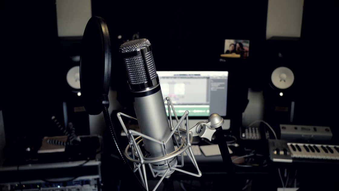
My small production room can accomplish what would have required a multi-room recording complex a decade ago...

My small production room can accomplish what would have required a multi-room recording complex a decade ago...

What I failed to see in all those meetings with my business mentor was that I was trying to market the "studio" when I should have been promoting myself. Jerusalem doesn't need another recording studio but, along with the rest of the world, it does need more innovative music producers and songwriters willing to take risks, go to great lengths for the sake of the song and who understand their clients' wishes and needs. So even if it's impossible to be #1 in the physical space game it's not impossible to be #1 in terms of blending your own mix of creativity, interpersonal skills and understanding of song-craft and musicians' needs.

I was my own unique selling proposition and so are you. The talent and knowledge you bring into the room is what makes you valuable in the music industry. Not the studio you work in or the gear you own or even the Fender Custom Shop Stratocaster you play. 2017 is not the year to open a recording studio but it is the year to be proud of the valuable work you do. So don't sell yourself short. 

Graphic Design Resources for Musicians - These 4 Websites Help Musicians Craft the Unique Images they NEED

I created this pretty quickly on Canva

I created this pretty quickly on Canva

The drummer at the gig I played at last night was lamenting to me that he has to make all these Facebook images for his band. It takes him a disproportionate amount of time to do the work and then it doesn't even look good. I feel for my friend because I was once in his shoes and it really is taxing to work on these images all day if you're a musician. Maybe we wouldn't mind so much if we were graphic designers, but alas, we are not.

It's mind-boggling how much musicians need to do today besides for playing music. As Graham Cochrane says, musicians need to realize that they are a brand, and by being a brand, they have to promote their brand by marketing themselves, paying for their own recordings, booking their own shows, getting people to their concerts etc. etc. I happen to think Graham is on the money. A large part of being your own brand is that you are a content creator. For better or worse, this is the state of the music industry. The colossal music-business infrastructure that many of us grew up with in the 90's has utterly collapsed. Nobody is going to make the graphic for your concert flyers but you.

When I first got started I would make these terrible images with my old Macbook's freeware cartoon maker. Don't ask, that was literally all I had access to that could overlay words above an image. It was super archaic and looked horrible. Luckily there are much better resources available to you online right now. It took me a while to discover them but I sure am happy now that I did because I use them all the time. They are fast, easy to use and my images look awesome (I think so anyways). Here are my 4 key resources - and the best part, you can use all of them totally for free.

  • PIXLR.com - This website can do it all. The problem is that it's a bit clunky and difficult for laying over the fonts, especially readjusting their position after you've moved on. I recommend PIXLR for filtering the background image before overlaying the words because you can really go deep on this and craft amazing unique images.
  • PEXELS.com - This site is amazing for finding stock images that you can download and use for free. That's pretty much all there is to it. If you already have great images of yourself as an artist or band you might not look here, but it's a great place to find things before getting creative.
  • CANVA.com - This website is great for putting words over images. If you're making a poster or flyer this is probably your best bet. They even have business card templates! I go to Canva a lot when I want to filter the image and write words over it. It's very flexible and you can go deep on your design ideas, however with many options people tend to over-design and then the images start to look amateur. So beware! 
  • ADOBE SPARK - This site is the easiest place to overlay words over images beautifully. You simply plug the words you want to say in and they create a stunning template to work with. You can add your own background image (even search for stock images) and tweak the fonts of what you write, the size and the style. They have this handy wheel that you turn with your mouse that shows you different fonts and styles as you move in either direction. Super intuitive! Because of the way you type things in, it's harder to get distracted and over-do the graphic like in Canva. I hear they even have an iPhone app (I can't personally attest to how good that works since I'm an Android guy)! The only downside with Adobe Spark is that the filtering on the background image is very limited. So If I'm looking for something more complex I can edit the image first on PIXLR or Canva and them import it into Adobe Spark for the words. Thanks to my buddy Rafi for letting me know about this awesome website!

As you can see, all these resources are very powerful. Each have their strengths and weakness but used together in tandem, you can pretty much get wherever you're looking to go within a reasonable amount of time. They might not be strong enough for my sister-in-law the graphic designer but they're strong enough for me. Check 'em out!